A few things have changed in the world of Print Prep since this blog was posted, please read our new blog, or contact us for the most up-to-date information.
Are you sitting down? Good. Let’s get real for a second: you may be submitting your artwork for print in a sub-optimal way.
This is fine, of course – we make adjustments and try to accommodate as much as possible. However, what if you could eliminate the back-and-forth between you and your print vendor? What if there were a few simple things you could do to make your final print product really stand out in the way that you originally envisioned? We’ve put together a handy checklist of a few key items to review before submitting your next project so that you and your print vendor can work together seamlessly.

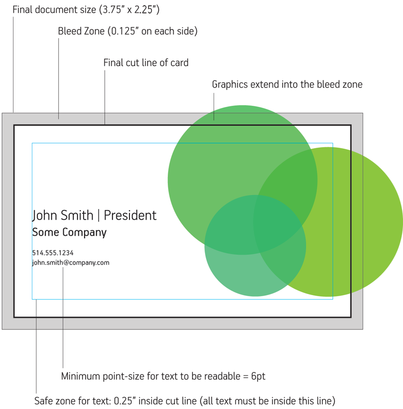
If you recall our previous article on preparing for your first print project, you’ll remember that a “bleed” refers to extending color to all edges of the sheet. In order to do this without sacrificing cutting off images or content, it is recommended that your artwork includes bleed and crop marks. As a general rule, it is advised to add an eighth of an inch (0.125’’) to each side to ensure that no part of the design is sacrificed when the paper is cut. Designate these markings in the software you are using (such as Adobe InDesign or Photoshop), and be sure to export your images to include those bleed and crop markings as well.
[caption id="attachment_2086" align="aligncenter" width="550"] Credit: Rubiks[/caption]
DPI, which stands for “dots per inch”, is synonymous with “resolution” in the print world. Having a high DPI (ideally around 300 dpi) is extremely important for print because it ensures that images are not pixelated. A design that is not large enough for printing purposes will appear blurry, and nobody wants that! Check your image resolution before you get too far into your artwork design, or you could end up needing to scrap the whole thing.

Colors are pretty important when it comes to designing artwork. Your company’s logo may use certain colors, for example, or you may have spent fifteen minutes searching for the perfect shade of green to complement a particular part of your design. To ensure that the colors you see on your screen reflect what you’ll see on printed material, set up your artwork using CMYK color (not RBG), or remember to convert from RGB to CMYK at the very end.

We love PDFs in the printing industry. Why? They make a printing job as clear-cut and simple as it can be. Exporting your artwork as a PDF ensures that all fonts and images are embedded properly and it will save your artwork in a smaller file size without sacrificing quality. Additionally, it will include all crop, bleed and margin markings to guarantee that your project prints exactly the way you want it to. This guide by Summit Printing has great step-by-step instructions on how to save your artwork as a PDF!

It’s common to have transparent areas or special effects when designing artwork. So common, in fact, that you may forget a very important step when finalizing your design: flattening your layers! Prior to submitting your artwork, flatten your image and test it out as a jpeg in your printer to ensure that colors, effects and transparent areas are showing up the way you intended. The same can also be said for text areas. Be sure to turn your editable font layers into shape layers (or outlines) to avoid errors occurring during the printing process.
Submitting print projects can be tricky, but it helps if you are prepared! For more tips and tricks for beginners, view our other article: How to Prep for Your 1st Print Project Like a Pro. Still have questions? Contact us.

