Editor’s Note: Mail piece design affects your mailing costs, your brand image and the effectiveness of your campaign. With all that at stake, you’d think it would one of the most important elements in a marketers or graphic designer’s toolbox. After all, if your mail isn’t delivered or arrives late – no one will see the great message you created. Count on us to help you “pre-game” your mailing with a quick consult on mailpiece design. We can help you ensure your message gets to your recipient.
What Exactly Is Mail Piece Design?
Before we jump into this discussion, it’s important to distinguish between direct marketing design (“Hey, that looks awesome, and it generated great customer responses!”), and technical design – as in giving the USPS what it wants for processing and postal discount purposes.
Both components are critical when designing an effective mail piece. For our purposes here, we’ll discuss the letter and postcard design – leaving flats and parcels for another post.
A lot goes into creating a great mail piece. Mailpiece design can be an intimidating topic, so we’ve broken this down into three parts:
- Direct marketing design tips
- USPS automation-compatible design tips
- Resources
Our goal here is providing you with a solid mail piece design overview, as well as some great resources… all in one convenient spot. You may want to consider bookmarking this one!
First, let’s talk about marketing mail piece design.
Direct Marketing Mail Piece Design Tips
There’s an old adage that still applies to all Marketing Mail. It goes, “List, Offer, Creative.” Before you get into the details, make sure you’ve got a good list, a great offer (or call to action), and compelling creative.
Copy: The undisputed king
The best direct marketing plan authors typically start with copy and build around it. So, when we talk about design, we logically start with copy. First thing’s first – write out the mail message and make sure it’s readable and not too long. Less is more – especially when you can put the details on a landing page or your blog. Not only is this tactic good for your mail piece, it’s great for your SEO. Keep your printed piece succinct and send them to your online presence for details.
Next – write a great headline. It’s the first thing you read, and if that doesn’t pull you in, you’ll probably throw out the mail piece. Give your headline the largest type on the page, and DON’T USE ALL CAPS! (It’s actually harder to read, and can be considered RUDE or SHOUTING).
Messaging: Stay focused
The purpose of direct marketing is to generate a response. Make your offer compelling, and instantly clear. A simple message, uncluttered and easy on the eye, will produce better results than attempting to cram too much information into your limited, precious space.
A strong call to action
When writing your call to action, our advice is to use three words or less to steer your visitor to a personalized landing page, or pURL, where you can capture your prospects’ data and capture their attention. Fostering a sense of urgency with offers, expiration dates, or limited spaces will also prompt prospects into action. Examples: Call Today, Contact Us Now or Get Started! (Please don’t use Read More or Get More Info. They’ve been proven to be weak CTA’s (calls-to-action).
Did we mention that content is king?
A wise writer once said good copy puts the reader first, your offer second, and the company last. Another (more mathematical view) is eighty percent of your content should be about the reader’s needs and twenty percent about you (or your company). Work on relating to your customers, and articulate their “pain points.” Your customers want to know you understand their struggles and relate to their needs.
Get personal!
Variable data printing and segmentation allows you to create a personalized message for every prospect. This intimate form of communication – done in moderation – creates a feeling of one-on-one communication. Just don’t get too personal… there’s a line between customization and creepy.
Keep it simple, smarty
When summing up copy-writing as a central design element, keeping it simple is a great golden rule. Trim, edit, trim some more, then shorten! It’s far harder to write short than to write long, but it’s worth the effort. That’s why we strongly support an integrated marketing campaign that quickly steers a visitor to a personalized landing page, where you can make a more elaborate case (and gain long-form SEO). The same goes for a phone number – prominently display your phone number, prompt a phone call, then close the deal.
After you’ve developed a compelling copy, it’s time to work with a designer to highlight and visually construct your key messages. Remember, any design element detracting from your primary goal – eliciting a response – is poor design, regardless of the visual appeal.
Specific Graphic Design Tips
Most of these tips are coming right from the mouth of our own creative director and print production manager.
Yes, a picture really is worth a thousand words. Choose artwork carefully, and try to build your design around one standout image or theme. Just make sure your images are high resolution. And similar to the copy-writing rule -- simple is better: When designing, less is often more… and white space is your friend!
Keep in mind people love to see pictures of other people, but stock photos stick out as having a canned feel. We recommend investing in your own pictures and adding a tagline under the images to draw more interest.
Can your message be quickly scanned and understood by the reader?
During the design phase, double-check your copy to make sure the key points jump right out and are constructed in a way that offers readers a quick summary. Use design elements to steer readers’ eyes directly to sell points. Sidebars and pull-out infographics are great ways to summarize important info. Speaking of “scannable copy,” never bury contact information as part of a paragraph – set contact info apart, as one of your main design elements. Call us at 1.800.686.6666 for help with your mail piece design; that kind of blends right in, no?
This stands out a bit better:
- Fancy fonts look cool, but conventional fonts are easier to read.
- Never use reverse body copy – white copy that is set against a color background. Unless, of course, you are building a website from 1998. NOTE: It’s ok in headers or as a design element. Just hard to read when it’s more than a couple of words.
- A lot of research has proven that certain colors sell better than others: Warmer reds, oranges, and yellows pull more sales than relaxing colors (blue and green).
Guard your brand
A final design note: Always protect your brand’s integrity and maintain consistent use of images, logos, fonts, colors, etc. Brand consistency should travel across all mediums – direct mail pieces, websites, signage, print ads, etc.
A few quick tips on actually executing your campaign:
- Use great data. (Remember your three key elements? List, Offer, Creative.) A superbly designed mail piece sent to a crummy list equals an unfortunate waste of time and money. Your mail services provider should be able to help scrub your list or provide one for you.
- Use that great data to segment your list in meaningful ways to get actionable business insights and develop a relevant message for each account.
- Follow up. Campaigns are called campaigns for a reason – the very name implies an ongoing effort. FYI: Your prospect is probably most receptive within one or two days after a direct mail piece is delivered. Think about adding additional touchpoints at that time, such as integrated email or online display ads delivered to them at their home address (yes, we can do that!).
- Stick to a schedule. Several mailings in sequence, building on a theme and creating brand awareness, pay off.
- Use a professional. Here at Midwest, our copywriter is known to mock up truly pitiful design pieces (in Word or PowerPoint, no less), much to the horror of our creative director. Yes, the technology is there – in theory – to make everyone a designer. But we strongly urge you to use a professional – especially if your mail services specialist offers writing and design assistance as a value-added service. The same goes for designing your overall campaign. Mail can be hard. Professional partners can take on the lion’s share of the load, making it much easier for you.
Learn Mail Piece Design for Automation-Compatible USPS Delivery – And Win Big!
Learn about the importance of postal compliance in The Ultimate Technical Guide on Mail Piece Design.
When we talk direct mail piece design, most of us are talking about the look, feel and effectiveness of the piece from a marketing standpoint.
The USPS has a very different definition of design: to the Post Office, it’s all about production processes and automation compatibility. It may not be sexy, but if you want your campaign to deliver, it is serious.
The USPS is interested in improved delivery service, machine compatibility, and postage discounts. They don’t care how pretty or clever your letter is, it’s all about being USPS-compliant. The goal is to achieve automation rates, by conforming to specs and employing an Intelligent Mail Barcode (IMb). Thus, designing with the back end in mind – from the very start – will save you heartache, time, and energy.
Editor’s Note: Before we freak you out with the following technical specs, know you can always contact us for help. We’re mail experts, work directly with the USPS, and can help you create your best mail piece design every time.
Mailpiece fundamentals
The most fundamental part of any mailing is the mail piece itself: properly designed mail pieces make it through machinery, qualify for discounts, actually get delivered, and please the Post Office to boot. This helpful link to Postal Explorer is a good place to start, and will “help you understand the Postal Service’s Business Reply and Courtesy Reply design requirements and will help you design reply mail pieces to qualify for postal discounts.”
The many faces of mail
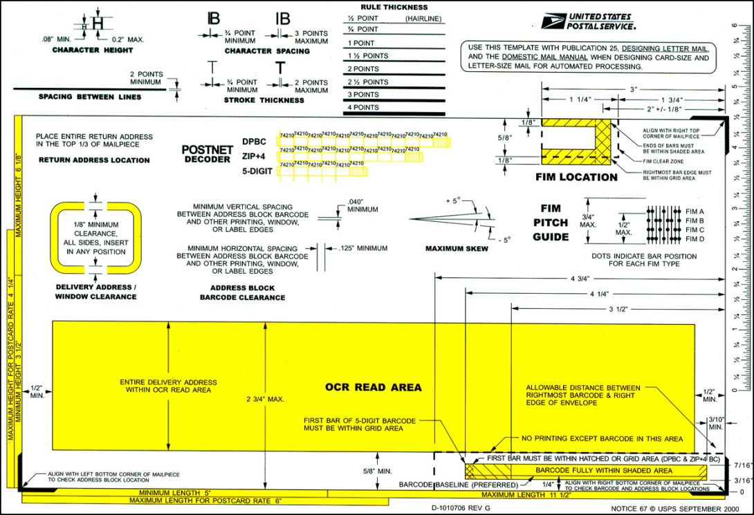
Next, it’s wise for designers and mailers to review the elements on the face of a mail piece. Clear space, bar code placement, return addresses, endorsements, it’s all here.
Hold on: Is it even mail-able?
The first question the USPS asks when reviewing your mail piece is “Is it mail-able?” Here are some mail piece basics every mailer and designer should know:
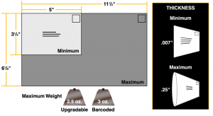
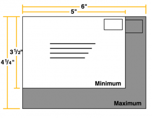
All letter-size mailpieces must be:
- Rectangular in shape
- At least 3 1 / 2 “ high
- At least 5” long
- At least .007” thick*
*It’s our experience that .007 is too thin to make it through a mail sorter properly – .009 is a more realistic number.
The Post Office summarizes: “Mail-ability refers to a mail piece that falls within minimum or maximum size standards.
When considering minimum standards, one must determine if a mail piece is at least ¼” inch thick or at least .007 inches thick, and must observe the orientation of the delivery address on a mail piece.”
Avoid non-machinable pitfalls
Considering that mail must run through machines – lightning-fast, automated mail presorting machines – you really do want your mail piece to be automation-compatible. (Watch our lightning-fast machines.) So, what makes a mail piece non-machinable (and thus vastly more expensive to mail)?
- Clasps, seals, and square letters that tumble and spin through sorting machines, for starters.
- Also, mail with loose items inside, pieces wrapped incorrectly in plastic, incorrectly tabbed mail and mail constructed with the wrong dimensions are all tickets to more postage.
Accurate addressing
The USPS considers the delivery address to be the most important information on your mail piece.
Mail sorting machines read mail pieces starting on the bottom and scan first for the city, state, and ZIP. Then the machines’ readers look for a delivery address: If the camera is confused by any other information or graphics, your mail might be missorted. More addressing guidelines, directly from the USPS, include:
- Always put the address and the postage on the same side of your mail piece.
- On a letter, the address should be parallel to the longest side.
- All capital letters.
- No punctuation.
- At least 10-point type.
- One space between city and state.
- Two spaces between state and ZIP Code.
- Simple type fonts.
- Left justified.
- Black ink on white or light paper.
- No reverse type (white printing on a black background on the envelope with a certain area).
- If your address appears inside a window, make sure there is at least 1/8-inch clearance around the address. Sometimes parts of the address slip out of view behind the window and mail processing machines can’t read the address.
- If you are using address labels, make sure you don’t cut off any important information. Also, make sure your labels are on straight. Mail processing machines have trouble reading crooked or slanted information.
Barcode placement
It’s imperative you put your barcode in the correct spot – the IMb is what qualifies (or disqualifies) you from automation prices. The USPS asks that:
- The rightmost (last) bar in the barcode must be at least .5” (1/2”) from the right edge of the mailpiece
- The leftmost (first) bar must be less than 10.5” from the right edge of the mailpiece and at least .5” (1/2”) from the left edge
- The top of each bar in the barcode must be less than 4” from the bottom edge of the mailpiece
Here are more details on designing letters and postcards for automated processing.
Business Reply Mail
Visit the USPS for more information and design templates for business reply mail.
When it's time to design...
We strongly urge you to consult Midwest early in the design process, prior to submitting your piece for printing and/or mailing. Whether you need help with marketing design, copy-writing, or navigating the hundreds of complex USPS design regulations, we can save you vast amounts of time and money. Mail can be hard, and we are really good at it!
In addition, here are some great resources to help you navigate mail piece design and the USPS:
“All the information you’ll need to develop and execute a successful, cost-efficient mailing.”
Physical standards for commercial letters and postcards
A visually sharp, easy-to-navigate guide for finding vendors, planning direct mail campaigns, Every Door Direct Mail, postage options, managing business mail and more.
Get inspired. See samples. Learn more about designing for your next direct mail campaign.
Ever wished you could email to your mailing list? Here’s how to reach some of your direct mail recipients via an email!
In summary: Go for both design elements – marketing and technical!
Create an eye-catching mail piece that cruises through mail sorting and land in your recipe. Likewise, envelopes that glide breezily through sorters, but reach consumers with a soft, dull thud are equally worthless. So, start your design efforts with both marketing effectiveness and with USPS specs in mind, and you’ll experience the glorious harmony that occurs when both mail piece design elements are married together in USPS-marketing bliss.
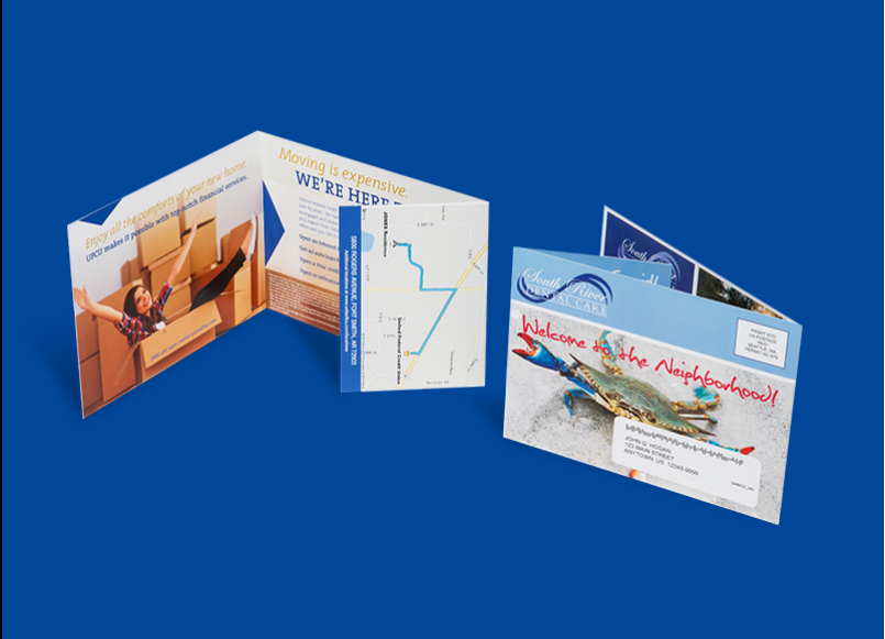
Mailpiece images above, as well as some of the specific mail piece regulation language, are taken from the USPS’s Mail Piece Design Course and related online resources. The USPS has a fabulous philosophy on training – they actually want you to use their materials and become educated!
Midwest Direct has hosted the USPS’s ace training teams at our Cleveland facility, and we’ve used their online library of materials to provide training ourselves for staff and clients. We strongly recommend you take the mailpiece design course when you have the time, or give us a call if you just want to consult one of our own mail pros!
