Mailpiece design affects your mailing costs, your brand image and the effectiveness of your campaign. Although the visual design of a mailpiece is important, the most fundamental part of any mailing is the technical design of the mailpiece itself. Properly designed mailpieces make it through machinery, qualify for discounts, actually get delivered, and please the Post Office.
Why You Must Pay Attention to the Details
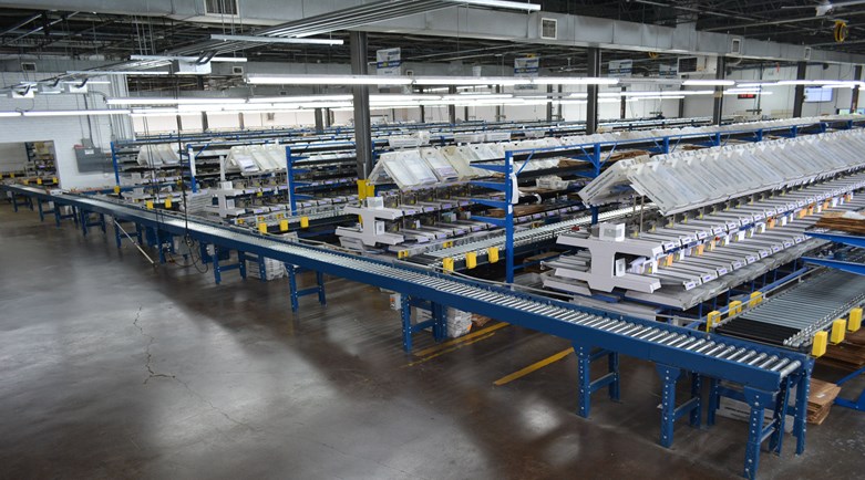
Keep in mind that mail runs through lightning-fast, automated sorting machines. (To see our sorters in action, or contact us for a tour!) If mailpieces are not automation compatible, they are non-machinable and thus vastly more expensive to mail. Here are some factors that make a mailpiece not automation compatible:
- Clasps, seals, and square letters that tumble and spin through sorting machines, for starters.
- Mail with loose items inside, pieces wrapped incorrectly in plastic, incorrectly tabbed mail and mail constructed with the wrong dimensions.
Delivery Address
Although the dimensions of a mailpiece are important, the delivery address is a crucial part of the information on your mailpiece.

Mail sorting machines read mailpieces starting on the bottom and scan first for the city, state, and ZIP. Then the machines’ readers look for a delivery address and if the camera is confused by any other information or graphics, your mail might be missorted. Here are some addressing guidelines from the USPS:
- Always put the address and the postage on the same side of your mailpiece.
- On a letter, the address should be parallel to the longest side.
- All capital letters and no punctuation.
- At least 10-point type.
- One space between city and state.
- Two spaces between state and ZIP Code.
- Simple type fonts.
- Left justified.
- Black ink on white or light paper.
- No reverse type (white printing on a black background on the envelope with a certain area).
- If your address appears inside a window, make sure there is at least 1/8-inch clearance around the address. Sometimes parts of the address slip out of view behind the window and mail processing machines can’t read the address.
- If you are using address labels, make sure you don’t cut off any important information. Also, make sure your labels are on straight. Mail processing machines have trouble reading crooked or slanted information.
Intelligent Mail Barcode
Additionally, it is imperative that the IMb (Intelligent Mail Barcode) is placed in the correct spot because it qualifies (or disqualifies) you from automation prices. The USPS asks that:
- The rightmost (last) bar in the barcode must be at least ½ inches from the right edge of the mailpiece.
- The leftmost (first) bar must be less than 10.5 inches from the right edge of the mailpiece and at least ½ inches from the left edge.
- The top of each bar in the barcode must be less than 4 inches from the bottom edge of the mailpiece.
But don’t worry, we can print or spray on the barcodes for you!
Design Tips to Engage Your Reader
Next, it’s wise for designers and mailers to review the elements on the face of a mailpiece. Clear space, bar code placement, return addresses, endorsements, it’s all here.

Keeping USPS standards in mind, design your mailpiece to be visually appealing with information that attracts your audience. Here are a few tips to remember with the visual and informational aspect of the mailpiece design:
- Start with copy and build around it, writing out a clear, concise, and readable mail message with a simple and compelling offer. Most of the content should be about the reader’s needs, and only some of it should be about the company. Articulate the customer’s “pain points” and relate the material to them.
- Write a great headline to capture the attention of the audience (and remember, do not use all caps! It feels forced and aggressive).
- Make sure to include a strong call-to-action statement such as “Contact Us Now.” We suggest using three words or less! (If you need help coming up with a call-to-action, call us!)
- Use great data (provided by your mail services provider) to segment your list into meaningful ways.
- Personalization is key! Variable data printing and segmentation creates a feeling of one-on-one communication by creating a personalized message for every prospect.
- Follow up - your prospect is probably most receptive within one or two days after a direct mailpiece is delivered. You can also add additional touchpoints such as social media advertisements, Informed Delivery emails, and online display ads through one fully integrated campaign with digital+post.
Make sure to avoid:
- Fancy fonts. These can be visually appealing but are too difficult to read. Likewise, reverse body copy (white copy set against a color background) can also be difficult to read.
- The wrong colors! Research shows that warmer reds, oranges, and yellows pull more sales than relaxing colors such as blue and green.
- An inconsistent use of images, logos, fonts, and colors. Brand consistency should travel across all mediums - mailpieces, websites, signage, print ads, etc.
The Details
The first question the USPS asks when reviewing your mailpiece is “Is it mail-able?”

Here are some mailpiece basics every mailer and designer should know:
All letter-size mailpieces must be:
- Rectangular in shape.
- Length must be at least 3 ½ inches.
- Width must be at least 5 inches.
- At least .007 inch thick.
However, It’s our experience that .007 is too thin to make it through a mail sorter properly – .009 is a more realistic number.
All flat-size mailpieces must be:
- More than 11 ½ inches in width, more than 6 ⅛ inches in length, or more than ¼ inch thick. For general retail mailability, all pieces 1/4 inch thick or less must be a minimum of 5 inches in width and 3 ½ inches in length and 0.007 inches thick.
- Not more than 15 inches in width, more than 12 inches in length, or more than ¾ inch thick.
- Flexible, uniformly thick, and rectangular with four square corners or finished corners that do not exceed a radius of ⅛ inch.
- Unwrapped, sleeved, wrapped, or enveloped.
If your mailpieces exhibit anything listed below, they are considered parcels and cannot be mailed as flats:
- Mailpieces that exceed any one of the maximum dimensions for a flat.
- A flat-size mailpiece that is non-rectangular, rigid, or not uniformly thick.
- A mailpiece that does not exceed 108 inches in combined length and girth.
Use all the help you can get!
Luckily, we have experts that can help you with your mailpiece design and make sure it is USPS compliant. We strongly urge you to consult Midwest early in the design process, prior to submitting your piece for printing and/or mailing. Whether you need help with marketing design, copy-writing, or navigating the hundreds of complex USPS design regulations, we can save you vast amounts of time and money.
Mail can be hard, and we are really good at it! Give us a call to consult one of our own mail pros!
